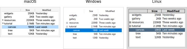
A treeview widget can display and allow browsing through a hierarchy of items, and can show one or more attributes of each item as columns to the right of the tree. It allows you to build user interfaces similar to the tree display you'd find in file managers like the OS X Finder or Windows Explorer. As with most Tk widgets, there is a ton of flexibility to make it behave as you need for a wide range of situations.
Treeview Widgets
Treeview widgets are created using the ttk::treeview command:
ttk::treeview .tree
Treeview widgets are created using the Tk::Tile::Treeview class:
tree = Tk::Tile::Treeview.new(parent)
Treeview widgets are created using the new_ttk__treeview method, a.k.a. Tkx::ttk__treeview():
$tree = $parent->new_ttk__treeview;
Treeview widgets are created using the ttk.Treeview function:
tree = ttk.Treeview(parent)
Horizontal and vertical scrollbars can be added in the usual manner, if desired.
Adding Items to the Tree
To do anything useful with the treeview, you'll need to add one or more items to it. Each item represents a single node in the tree, whether a leaf node or an internal node. Items are referred to by a unique id; this can be assigned by the programmer when the item is first created, or the widget can automatically choose an id for the item.
Items are created by inserting them into the tree, using the treeview's '"insert" method. To insert an item, you need to know where in the tree to insert it, which means specifying the parent item as well as what position in the list of the parent's children the new item should be inserted at.
The treeview widget automatically creates a root node (which is not displayed), having the id of "{}" (i.e. the empty string), which can serve as the parent of the first level of items you add. Positions within the list of the parent's children are specified by index (0 being the first, with the special "end" index meaning inserting after all existing children).
Normally, you'll also specify the name of each item, which is displayed in the tree. There are other options to add an image beside the name, specify whether the node is open or closed, and so on.
# Inserted at the root, program chooses id:
.tree insert {} end -id widgets -text "Widget Tour"

# Same thing, but inserted as first child:
.tree insert {} 0 -id gallery -text "Applications"

# Treeview chooses the id:
set id [.tree insert {} end -text "Tutorial"]

# Inserted underneath an existing node:
.tree insert widgets end -text "Canvas"
.tree insert $id end -text "Tree"
Inserting the item returns the id of the newly created item.
# Inserted at the root, program chooses id:
tree.insert('', 'end', :id => 'widgets', :text => 'Widget Tour')

# Same thing, but inserted as first child:
tree.insert('', 0, :id => 'gallery', :text => 'Applications')

# Treeview chooses the id:
item = tree.insert('', 'end', :text => 'Tutorial')

# Inserted underneath an existing node:
tree.insert( 'widgets', 'end', :text => 'Canvas')
tree.insert( item, 'end', :text => 'Tree')
Inserting the item returns an object for the item, allowing you to refer to the item, for example as a parent in future "insert" calls. If you'd like to retrieve the id for the item, you can use the item's "id" method.
# Inserted at the root, program chooses id:
$tree->insert("", "end", -id => "widgets", -text => "Widget Tour");

# Same thing, but inserted as first child:
$tree->insert("", "0", -id => "gallery", -text => "Applications");

# Treeview chooses the id:
$id = $tree->insert("", "end", -text => "Tutorial");

# Inserted underneath an existing node:
$tree->insert("widgets", "end", -text => "Canvas");
$tree->insert($id, "end", -text => "Tree");
Inserting the item returns the id of the newly created item.
# Inserted at the root, program chooses id:
tree.insert('', 'end', 'widgets', text='Widget Tour')

# Same thing, but inserted as first child:
tree.insert('', 0, 'gallery', text='Applications')

# Treeview chooses the id:
id = tree.insert('', 'end', text='Tutorial')

# Inserted underneath an existing node:
tree.insert('widgets', 'end', text='Canvas')
tree.insert(id, 'end', text='Tree')
Inserting the item returns the id of the newly created item.
Rearranging Items
A node (and its descendants, if any) can be moved to a different location in the tree; the only restriction is that a node cannot be moved underneath one of its descendants. The target location is specified via parent and index into the list of children, as was done with "insert".
.tree move widgets gallery end; # move widgets under gallery
tree.move('widgets', 'gallery', 'end'); # move widgets under gallery
$tree->move("widgets", "gallery", "end"); # move widgets under gallery
tree.move('widgets', 'gallery', 'end'); # move widgets under gallery
Items can be detached from the tree, which removes the item and its descendants from the hierarchy, but does not destroy the items, allowing you to later reinsert them with "move".
.tree detach widgets
tree.detach('widgets')
item.detach
$tree->detach("widgets");
tree.detach('widgets')
Items can also be deleted, which does completely get rid of the item and its descendants.
.tree delete widgets
tree.delete('widgets')
item.delete
$tree->delete("widgets");
tree.delete('widgets')
If you'd like to navigate the hierarchy, there are methods that let you find the parent of an item ("parent"), find the next or previous siblings of an item ("next" and "prev"), and return the list of children of an item ("children").
You can control whether or not the item is open and shows its children by modifying the "open" item configuration option.
.tree item widgets -open true
set isopen [.tree item widgets -open]
tree.itemconfigure('widgets', 'open', true); # or item['open'] = true
isopen = tree.itemcget('widgets', 'open');   # or isopen = item['open']
$tree->item("widgets", -open => "true");
$isopen = $tree->item("widgets", "-open");
tree.item('widgets', open=TRUE)
isopen = tree.item('widgets', 'open')
Displaying Information for each Item
The treeview can also display one or more additional pieces of information about each item, which are shown as columns to the right of the main tree display.
Again, each column is referenced by a symbolic name that you assign. You can specify the list of columns using the"columns" configuration option of the treeview widget, either when first creating the widget, or later on.
ttk::treeview .tree -columns "size modified"
.tree configure -columns "size modified owner"
tree = Tk::Tile::Treeview.new(parent) {columns 'size modified'}
tree['columns'] = 'size modified owner'
$tree = $parent>->new_ttk__treeview(-columns => "size modified");
$tree->configure(-columns => "size modified owner");
tree = ttk.Treeview(root, columns=('size', 'modified'))
tree['columns'] = ('size', 'modified', 'owner')
You can specify the width of the column, how the display of item information in the column is aligned, and more. You can also provide information about the heading of the column, such as the text to display, an optional image, alignment, and a script to invoke when the item is clicked (e.g. to sort the tree).
.tree column size -width 100 -anchor center
.tree heading size -text "Size"
tree.column_configure( 'size', :width => 100, :anchor => 'center')
tree.heading_configure( 'size', :text => 'Size')
$tree->column("size", -width => 100, -anchor => "center");
$tree->heading("size", -text => "Size");
tree.column('size', width=100, anchor='center')
tree.heading('size', text='Size')
The values to place in each column for each item can be specified either individually, or by providing a list of values for the item. In the latter case, this is done using the "values" item configuration option (and so can be used either when first inserting the item or later) which takes a list of the values; the order of the list must be the same as the order in the"columns" widget configuration option.
.tree set widgets size "12KB"
set size [.tree set widgets size]
.tree insert "" end -text Listbox -values [list "15KB" "Yesterday" "mark"]
tree.set('widgets', 'size', '12KB'); # or item.set('size', '12KB')
size = tree.get('widgets', 'size');  # or item.get('size')
tree.insert('', 'end', :text => 'Listbox', :values => ['15KB','Yesterday','mark'])
$tree->set("widgets", "size", "12KB");
$size = $tree->set("widgets", "size");
$tree->insert("", "end", -text => "Listbox", -values => "15KB Yesterday mark");
tree.set('widgets', 'size', '12KB')
size = tree.set('widgets', 'size')
tree.insert('', 'end', text='Listbox', values=('15KB Yesterday mark'))
Item Appearance and Events
Like the text and canvas widgets, the treeview widget uses tags to help you modify the appearance of items in the tree. You can assign a list of tags to each item using the "tags" item configuration option (again, when creating the item or later on).
Tag configuration options can then be specified, which will then apply to all items having that tag. Valid tag options include "foreground" (text color), "background", "font", and "image" (not used if the item specifies its own image).
You can also create event bindings on tags, which let you capture mouse clicks, keyboard events etc.
.tree insert "" end -text button -tags "ttk simple"
.tree tag configure ttk -background yellow
.tree tag bind ttk <1> "itemclicked"; # the item clicked can be found via [.tree focus]
tree.insert('', 'end', :text => 'button', :tags => ['ttk','simple'])
tree.tag_configure('configure', 'ttk', :background => 'yellow')
tree.tag_bind('ttk', '1', proc{itemclicked}); # the item clicked can be found via 'tree.focus_item'
You'll note the repeated "configure" when trying to do a tag_configure; this is a bug in the RubyTk API. Not to worry though, because until that is fixed, the tag configure itself won't do anything anyway. Doh!
$tree->insert("", "end", -text => "button", -tags => "ttk simple");
$tree->tag_configure("ttk", -background => "yellow");
$tree->tag_bind("ttk", "<1>", sub{itemClicked}); # the item clicked can be found via $tree->focus
	tree.insert('', 'end', text='button', tags=('ttk', 'simple'))
tree.tag_configure('ttk', background='yellow')
tree.tag_bind('ttk', '<1>', itemClicked); # the item clicked can be found via tree.focus()
The treeview will generate virtual events "<TreeviewSelect>", "<TreeviewOpen>" and "<TreeviewClose>" which allow you to monitor changes to the widget made by the user. You can use the "selection" method to determine the current selection (the selection can also be changed from your program).
Customizing the Display
There are many aspects of how the treeview widget is displayed that you can customize. Some of them we've already seen, such as the text of items, fonts and colors, names of column headings, and more. Here are a few additional ones.
- Specify the desired number of rows to show using the "height" widget configuration option.
- Control the width of each column using the column's "width" or "minwidth" options. The column holding the tree can be accessed with the symbolic name "#0". The overall requested width for the widget is based on the sum of the column widths.
- Choose which columns to display and the order to display them in using the "displaycolumns" widget configuration option.
- You can optionally hide one or both of the column headings or the tree itself (leaving just the columns) using the"show" widget configuration option (default is "tree headings" to show both).
- You can specify whether a single item or multiple items can be selected by the user via the "selectmode" widget configuration option, passing "browse" (single item), "extended" (multiple items, the default), or "none".